
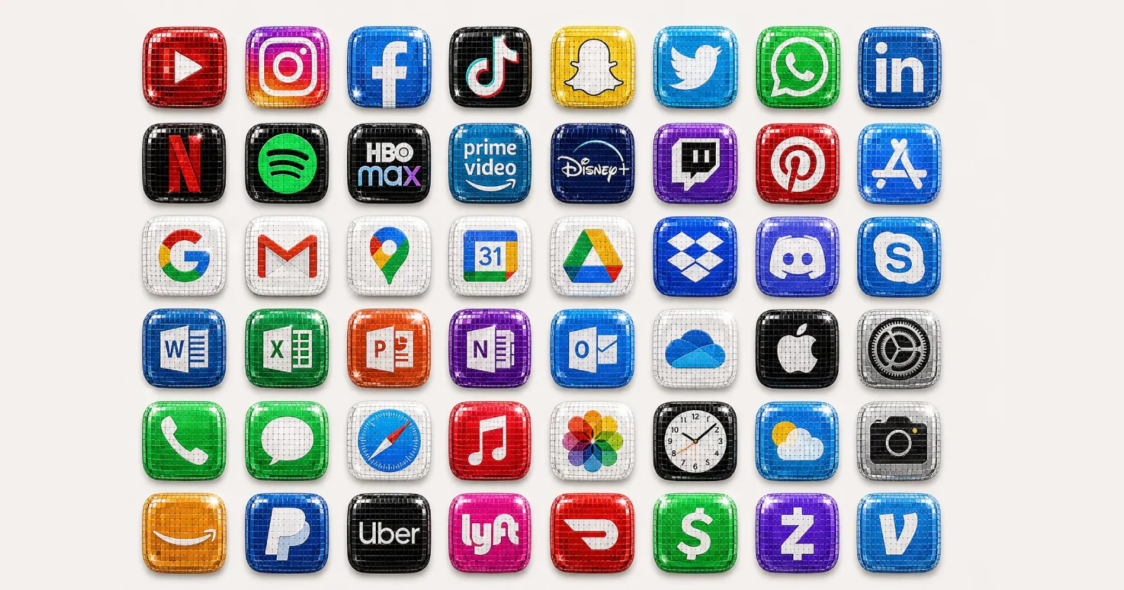
In the ever-evolving world of digital design, a new trend has emerged from a place of unexpected controversy. It started as a temporary, divisive change by a major streaming service and quickly transformed into a viral internet movement. This phenomenon, now known as “Discomorphism,” is reshaping how brands and designers think about logos, marketing, and user engagement in 2026.
At its core, Discomorphism is a design style that turns flat, minimalist logos into shimmering, reflective disco balls. It is characterized by mirrored tiles, glossy chrome textures, and dramatic light reflections that create a 3D, party-like aesthetic. This trend represents a significant departure from the decade-long reign of flat and minimalist design in tech. It signals a shift towards expressive visuals, playful branding, and a nostalgic nod to retro-futurism and the glamour of the 1970s disco era. The movement, however, is about more than just aesthetics; it’s a commentary on internet culture, brand agility, and the relentless pursuit of social media engagement.
The Spark: Spotify’s 20th Anniversary Glow-Up
The story of Discomorphism begins on May 13, 2026, when Spotify, the global audio streaming service, decided to celebrate its 20th anniversary in a bold and unconventional way. For a limited time, they swapped their iconic, flat green app icon for a 3D, shimmering, dark-green disco ball, complete with reflective panels and the signature three black soundwaves on its surface. This change was part of the “Spotify 20: Your Party of the Year(s)” promotion, an in-app experience designed to let users revisit their listening history and celebrate the platform’s two decades of existence.
The initial reaction was nothing short of chaotic. The redesign was rolled out without a major prior announcement, leading to mass confusion among its hundreds of millions of users. Many woke up to find their familiar app icon had transformed, leading to a wave of complaints. Users speculated that their app was broken, stuck in an update, or that their phone screen was malfunctioning. The aesthetic itself was polarizing, with critics calling it “sterile,” “grim,” and “pixelated” on smaller phone screens. One user on X (formerly Twitter) famously declared it the “biggest downgrade in history”. A common complaint was that the dark green color and the mosaic pattern made the icon look like a shield or a glitched app rather than a disco ball.
The Birth of a Movement: From Criticism to Viral Trend
While the backlash was severe, it was the internet’s response to this backlash that sparked the Discomorphism trend. As users roasted the new design, they began to call the style “Discomorphism,” a playful portmanteau combining “disco” and “skeuomorphism”. Skeuomorphism is a design concept where digital elements mimic their real-world counterparts—in this case, a logo mimicking the shiny, reflective surface of a physical disco ball.
What started as a term of mockery soon became a badge of honor. While Spotify defended the temporary change, the creative community saw an opportunity. A notable moment in the trend’s evolution came when Race Johnson, co-founder of Pixly, posted a thread of “disco-fied” versions of famous app logos, coining the term “discomorphism” as a legitimate aesthetic. This post garnered significant attention, accumulating nearly 2 million views and kickstarting the viral movement.
Instead of fading away, the aesthetic became a meme, and the marketing world saw a goldmine. Other brands and social media teams started jumping onto the trend by “disco-balling” their own logos. OpenAI’s ChatGPT account posted its own mirror-ball logo on Instagram, giving the trend a massive boost. This was quickly followed by companies like Picsart, MoonPay, and Uniswap, who turned their logos into shimmering, chrome-covered icons designed for maximum social media attention. The traditional concept of a brand’s logo was being treated like a viral filter, a digital costume that companies could temporarily don to participate in online culture. Even Google joined the fray, rolling out a “Disco” custom icon pack for Pixel phones that turned home screens into a wall of glittering, mirror-ball-styled icons.
How to Create Your Own Discomorphic Logo
Part of the reason Discomorphism spread so quickly is because AI tools made recreating the style ridiculously easy. Users can now generate disco-ball versions of logos within seconds, making the trend accessible to everyone from multi-billion dollar corporations to individual designers and social media users.
One of the most popular tools is the dedicated app, “Discomorphism,” built by the AI platform Lovable. This app uses artificial intelligence to give any logo the disco ball treatment. The developers describe their tool as, “Make your logo dance. Drop your brand mark. We coat it in mirror tiles, hit it with the disco lights, and hand you back a one-of-a-kind app icon”.
Here are the simple steps to create your own Discomorphic design:
A. Visit the App: Go to the designated Discomorphism app URL on your phone or computer.
B. Upload Your Logo: Click or tap to upload a photo of your logo into the designated box.
C. Discofy It: Press the “Discofy it” button.
D. Receive Your Creation: Within seconds, the app will work its magic, turning the standard logo into a shiny, reflective version covered in a disco ball effect.
For those who prefer more control over the process, designers have shared more advanced workflows, particularly using AI image generators like ChatGPT and Gemini. A typical advanced prompt might instruct the AI to:
“Transform this logo into a futuristic disco-ball version while keeping the original shape and geometry unchanged. Use reflective mirror tiles, chrome textures, cinematic lighting, glossy 3D depth, realistic reflections, retro disco aesthetic, dark background, high detail, vibrant highlights, and premium branding style. Make it look like a viral 2026 app icon trend”.
This combination of a dedicated app and AI prompts created a perfect recipe for viral content: it was easy, fast, visually striking, and tapped into a collective sense of humor about corporate branding.
The Design and Business Implications
Beyond the hype, the Discomorphism trend raises important questions about the direction of user interface (UI) and brand design. For over a decade, tech branding lived in its “clean girl aesthetic” era, dominated by flat icons, muted colors, and minimalist logos. Discomorphism signals a dramatic shift away from sterile, generic design toward something louder, nostalgic, and intentionally playful. It’s a move away from corporate minimalism and towards “main character energy”.
However, this trend is not without its critics. Some designers and industry experts argue that while Discomorphism is excellent for marketing and creating hype, it is a poor foundation for long-term UI design. Applying “disco-morphism” to a banking app or a SaaS dashboard, they argue, would be a recipe for a terrible user experience (UX). This sentiment echoes the broader industry fatigue with micro-trends, which are often criticized for their lack of accessibility, development overhead, and branding dilution. Skeptics point out that Discomorphism is simply a micro-subset of Skeuomorphism, a marketing wrapper around a temporary branding exercise rather than a foundational shift in how humans interact with machines.
From a business perspective, the trend highlights a significant shift in branding strategy. In 2026, branding is no longer just about consistency. It is about surviving the algorithm long enough to become the meme of the week. Instead of polished, long-term campaigns, companies are increasingly using temporary visual trends to boost engagement and stay relevant online. Discomorphism shows how quickly online criticism can turn into marketing momentum. What started as a temporary Spotify anniversary icon has now become one of the most talked-about digital design trends of the year. It demonstrates that today’s most effective marketing is often community-driven, meme-focused, and internet-first.
The End of an Era: Spotify Returns to Normal
Despite the global trend it spawned, Spotify was always clear about its intentions. Following the initial backlash, the company confirmed that the disco ball logo was only temporary. In a now-famous reply to a disgruntled user on X, Spotify wrote, “Alright, we know glitter is not for everyone. Our temp glow-up ends soon. Your regularly scheduled Spotify icon returns next week”.
This move was confirmed by Fast Company, which reported that the disco ball icon was always supposed to be a temporary change for the anniversary. By the final week of May 2026, the familiar flat green logo was restored, ending the official era of the Spotify disco ball. While Spotify returned to its classic, minimalist icon, the “Discomorphism” aesthetic it accidentally inspired lives on.
Conclusion: A New Chapter in Digital Branding
The Discomorphism trend of 2026 was a perfect storm of design, internet culture, and marketing savvy. It was a momentary rebellion against the years of minimalist design that dominated the tech industry, welcoming a new era of playful, nostalgic, and highly shareable visual content. While its longevity as a UI standard remains questionable, its impact on brand strategy is undeniable.
The legacy of Discomorphism is a powerful lesson for brands: in the fast-paced digital landscape, the ability to adapt quickly, participate in cultural moments, and engage with communities is often more valuable than sticking rigidly to a brand book. The trend shows that a “mistake” can be transformed into a marketing masterstroke with the right AI tools and an internet-savvy audience. The Disco Ball is no longer just a party fixture; it has become a symbol of modern, agile branding.