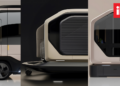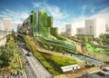

In the vast digital expanse of the internet, certain aesthetic movements capture the collective imagination and transport us to an era of boundless optimism and technological wonder. One such movement that has experienced a remarkable resurgence in recent years is the Retro Frutiger Aero City Aesthetic. This distinctive design language, which flourished from the mid-2000s to the early 2010s, represents a fascinating intersection of nature, technology, and urban living that continues to captivate Generation Z and millennials alike . The aesthetic, named for the Frutiger typeface and Windows Aero interface, embodies a vision of the future that was hopeful, glossy, and fundamentally optimistic about the relationship between humanity and technology .
Understanding the Origins of Frutiger Aero
The emergence of Frutiger Aero was intrinsically linked to the technological developments of the Y2K era and the transition to Web 2.0. The late 1990s and early 2000s marked a period of significant societal transformation, characterized by both curiosity and anxiety about the future . The Y2K bug, a coding issue projected to potentially cause chaos in computer systems at the turn of the millennium, created an atmosphere of uncertainty that ultimately gave way to relief when the transition occurred without major incidents . This period of technological anxiety and subsequent relief created fertile ground for the emergence of a more optimistic design aesthetic.
The true genesis of Frutiger Aero can be traced to Microsoft’s development of the Windows Aero interface. The Aero design language, first appearing in Windows Vista and later refined in Windows 7, introduced translucent panels, glass-like textures, and a visual sophistication that had not been seen before in mainstream operating systems . According to Microsoft’s official Aero Aesthetics guide, the name Aero derives from the initials of Authentic, Energetic, Reflective, and Open, reflecting the design philosophy behind the interface . This design approach represented one of the first mature examples of what would later be recognized as Frutiger Aero.
The Consumer Aesthetics Research Institute (CARI), an online community dedicated to documenting and categorizing visual aesthetics, played a crucial role in naming this movement. In 2017, Sofi Xian (formerly Sofia Lee) of CARI coined the term “Frutiger Aero” to describe the design aesthetic that had been prevalent from approximately 2004 to 2013 . The name combines the Frutiger font family, designed by Adrian Frutiger in 1970, with Windows Aero, although ironically, the Frutiger typeface was not actually used in the Windows interfaces associated with the movement .
Key Characteristics of the Frutiger Aero Aesthetic
The Frutiger Aero aesthetic is defined by a distinctive set of visual elements that create a cohesive and immediately recognizable style. Understanding these characteristics is essential for appreciating the movement’s impact on design and its enduring appeal.
A. Nature and Technology Integration
At its core, Frutiger Aero represents the harmonious integration of nature and technology. This theme was central to the aesthetic and distinguished it from its predecessor, Y2K, which often portrayed technology as mysterious and potentially threatening . In Frutiger Aero, natural elements such as blue skies, grass, tropical fish, and water droplets were seamlessly combined with technological imagery like glossy interfaces, futuristic architecture, and digital displays . This visual language conveyed a message of technological optimism a belief that technological progress would enhance rather than diminish our connection to the natural world .
B. Skeuomorphism and Glass Textures
One of the most distinctive features of Frutiger Aero was its use of skeuomorphism, a design approach that incorporates real-world textures and objects into digital interfaces . This included glass-like textures, glossy surfaces, and three-dimensional representations of physical objects. The goal of skeuomorphism was to make digital experiences more accessible and intuitive for users who were new to touchscreen technology and personal computing . The shiny, reflective surfaces and realistic textures created a sense of familiarity and approachability that helped acclimate users to increasingly sophisticated digital environments.
C. Bright and Optimistic Color Palette
The Frutiger Aero color palette was characterized by bright, optimistic colors that reflected its positive outlook on the future . Blue and green dominated, representing the natural world and conveying freshness and vitality . These were complemented by accent colors such as sunshine yellow, coral orange, and soft pink, creating a vibrant and energetic visual experience . The use of gradient colors and high-definition imagery was made possible by advances in computer-aided design and screen technology, allowing for more complex and visually rich designs .
D. Floating Elements and Dynamic Movement
Frutiger Aero designs often incorporated floating elements and a sense of dynamic movement . Bubbles, lens flares, auroras, and bokeh effects created a sense of depth and fluidity, while pulsating neon lights and gently undulating ripples added a tranquil, mesmerizing quality to the visual experience . This sense of movement reflected the dynamic nature of the Web 2.0 era, when the internet was transitioning from static web pages to interactive, user-generated content .
E. Curved and Amorphous Forms
The aesthetic favored soft edges and amorphous, organic forms rather than sharp, angular lines . This design choice contributed to the friendly and approachable nature of Frutiger Aero, making technology feel less intimidating and more human-centered. The use of curved forms in both digital interfaces and physical spaces reinforced the connection between technology and organic natural shapes .
The Evolution of Retro Frutiger Aero City Aesthetic
The concept of the “Retro Frutiger Aero City Aesthetic” extends beyond digital interfaces to envision entire urban environments shaped by this design philosophy. This expanded application of the aesthetic imagines cities where technology and nature coexist in perfect harmony, creating spaces that are both futuristic and deeply connected to the natural world.
A. Urban Design and Architecture
In the Retro Frutiger Aero city, architecture embraces the glossy, transparent, and curved forms characteristic of the aesthetic. Buildings feature glass facades with iridescent sheens, rounded corners, and integrated green spaces that bring nature into the urban environment. This architectural vision draws on the optimistic urban planning concepts of the 1960s and 1970s, which imagined cities as utopian spaces of efficiency and beauty . The integration of nature and technology is a central theme, with vertical gardens, rooftop forests, and aquaponic systems woven into the fabric of the city.
The influence of Frutiger Aero on real-world interior and architectural design was significant during its peak period . Technology brands, in particular, adopted the aesthetic in their flagship stores, creating retail environments that reflected the glossy, optimistic vision of their digital interfaces . Spaces such as the O2 flagship store in Munich demonstrated how elements of Frutiger Aero could be translated from digital screens to physical environments through the use of smooth surfaces, blue and white color schemes, and nature-technology themed visuals .
B. Public Spaces and Interaction
Public spaces in the Retro Frutiger Aero city are designed to facilitate positive human interaction with technology. Interactive displays with glass-like interfaces, information kiosks with rounded edges and glowing screens, and benches with integrated technology create an environment where digital and physical experiences blend seamlessly. The design philosophy suggests that technology should enhance rather than dominate the urban experience, creating spaces that feel both cutting-edge and humane.
C. Transportation and Infrastructure
The aesthetic extends to transportation infrastructure, with futuristic monorails, pod-like transit vehicles, and stations that feature the characteristic glass and chrome surfaces of the style. These transportation elements draw on retro-futurist visions of the future, combining the sleek design of the mid-20th century with contemporary technology . The overall effect is a transportation network that feels both efficient and aspirational.
D. Commercial and Retail Spaces
Retail environments in the Retro Frutiger Aero city embrace the glossy, optimistic aesthetic of the movement. Stores feature transparent displays, glowing signage, and interior design that combines clean lines with natural elements. The goal is to create shopping experiences that feel both futuristic and welcoming, reflecting the design philosophy of early 2000s tech stores .
The Resurgence of Frutiger Aero
The Frutiger Aero aesthetic experienced a remarkable resurgence beginning in 2023, particularly among Generation Z users on social media platforms such as TikTok, YouTube, and Reddit . This revival reflects a growing nostalgia for a period when technology seemed more optimistic and the internet felt less dominated by algorithms and social pressures .
A. Nostalgia as a Cultural Force
The revival of Frutiger Aero is part of a broader trend of digital nostalgia that has shaped contemporary consumer culture. For many younger consumers, the aesthetic represents a simpler, happier time when social media was less intense and technology felt more accessible and fun . This nostalgia has been fueled by economic uncertainty, the climate crisis, and the increasingly overwhelming nature of modern digital life. The longing for a more optimistic vision of the future reflects a desire to escape the anxieties of the present and imagine alternative possibilities .
B. Contrast with Modern Design Trends
The resurgence of Frutiger Aero can also be understood as a reaction to the minimalist, flat design that has dominated user interfaces since the 2010s . The corporate Memphis style, characterized by simple, flat illustrations in bold colors, has become ubiquitous in tech marketing and design . Frutiger Aero offers an alternative that is more playful, more detailed, and more connected to nature. This maximalist approach appeals to users who find modern design styles sterile and unengaging.
C. The Counter-Minimalist Movement
The growing interest in Frutiger Aero reflects a broader cultural shift away from minimalism in design. In contrast to the clean lines and simple surfaces of flat design, Frutiger Aero embraces complexity, texture, and visual richness. This aesthetic preference aligns with the desire for more diverse and interesting digital experiences that engage the senses and imagination.
D. Environmental Awareness and Techno-Optimism
The nature-focused elements of Frutiger Aero have also contributed to its revival. In an era of heightened environmental awareness, the aesthetic’s representation of technology in harmony with the natural world resonates with contemporary values . Some commentators have suggested that the optimism inherent in Frutiger Aero appeals to users who are concerned about climate change and seeking hopeful visions of the future .
E. Gen Z’s Nostalgic Connection to Frutiger Aero
For Gen Z, Frutiger Aero evokes memories of childhood experiences with early touchscreen devices, video game consoles, and the vibrant, optimistic design of Web 2.0 . The aesthetic represents a formative period in their digital lives, making it a source of comfort and nostalgia . The reemergence of Frutiger Aero offers an escape from the often bleak and transactional nature of contemporary online culture, providing a reminder of a time when the internet felt more playful and less corporate .
Key Elements of the Retro Frutiger Aero City Aesthetic
To fully understand the Retro Frutiger Aero City Aesthetic, it is helpful to break down its key elements and consider how they work together to create a cohesive visual language. Based on the characteristics of the Frutiger Aero style and its application to urban and architectural design, the following elements are central to this aesthetic.
A. Glossy and Glass-like Textures
One of the most defining features of this aesthetic is the use of glossy, glass-like textures. Buildings, vehicles, and digital interfaces share a high-shine, reflective quality that conveys a sense of technological sophistication and cleanliness . This texture is often paired with iridescent or pearl-like effects, creating surfaces that catch and reflect light in mesmerizing ways. In physical spaces, this translates into the use of glass, polished metal, and acrylic materials that create sleek, modern environments.
B. Bright, Organic Color Palette
The color palette of the Retro Frutiger Aero city draws on the optimistic tones of its digital origins. Sky blues, oceanic turquoises, and vibrant greens dominate, reflecting the influence of natural elements. These are complemented by accent colors such as coral orange, sunshine yellow, and soft pink, creating a rich and visually engaging environment . The overall effect is bright and uplifting, reinforcing the aesthetic’s optimistic outlook.
C. Nature-Integrated Architecture
A key principle of this aesthetic is the integration of nature into urban spaces. Buildings feature green roofs, vertical gardens, and ample natural light, bringing the outdoors into the city. This integration is not merely decorative but reflects a belief that technology and nature should work in harmony . The inclusion of natural elements softens the urban environment and creates spaces that are both functional and nurturing.
D. Curved, Organic Forms
In contrast to the sharp angles of modernist architecture, the Retro Frutiger Aero city embraces curved, organic forms. Buildings, furniture, and infrastructure all feature rounded edges and flowing lines, creating a sense of fluidity and movement . This design approach makes the urban environment feel more welcoming and less intimidating, aligning with the friendly, accessible nature of the original aesthetic.
E. Futuristic Yet Accessible Technology
Technology in the Retro Frutiger Aero city is advanced yet approachable. Interfaces are intuitive, devices are designed to be user-friendly, and digital systems integrate seamlessly into the urban landscape. This reflects the design philosophy of the original Frutiger Aero movement, which aimed to make technology accessible to all users by incorporating familiar, real-world elements .
F. Skeuomorphic Digital Interfaces
Digital interfaces in the Retro Frutiger Aero city continue to embrace skeuomorphism, incorporating textures and elements from the physical world. This makes technology feel familiar and approachable, reinforcing the connection between digital and physical experiences . The use of realistic textures and 3D elements creates a sense of depth and engagement that is often missing from modern flat design .
G. Optimistic and Hopeful Atmosphere
Underlying all these elements is a sense of optimism and hope for the future. The Retro Frutiger Aero city embodies a belief that technology can improve our lives and that a better future is possible . This positivity is reflected in the bright colors, natural elements, and welcoming design of the aesthetic, creating an environment that feels aspirational and uplifting.
H. Eco-Friendly Features and Green Infrastructure
The Retro Frutiger Aero city is also characterized by its commitment to environmental sustainability. Buildings incorporate energy-efficient systems, green roofs, and renewable energy sources. The city includes parks, green spaces, and nature preserves that bring the natural world into the urban environment, creating a healthier, more sustainable place to live and work.
The Cultural Impact and Significance of the Revival
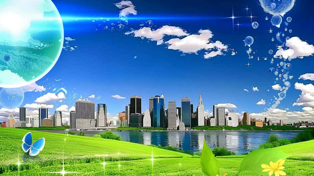
The revival of the Retro Frutiger Aero City Aesthetic goes beyond mere nostalgia. It reflects a deeper cultural desire to imagine alternative futures and to challenge the dominance of contemporary design styles. The aesthetic provides a space for hope and optimism in an era often marked by anxiety and uncertainty.
A. A Vision of Alternative Futures
The Retro Frutiger Aero city represents a vision of what the future could have been a future where technology and nature coexisted in perfect harmony. This retrospective optimism offers an alternative to the often dystopian visions of the future that have dominated popular culture in recent years . By revisiting a more hopeful vision, the aesthetic encourages us to imagine possibilities beyond the constraints of contemporary reality.
B. Reclaiming Corporate Aesthetics
Some scholars have noted that the revival of Frutiger Aero represents an attempt to reclaim a corporate aesthetic for personal and cultural expression . In its original context, the aesthetic was created by technology companies to market their products and services. Today, however, it has been reinterpreted by users who see in it a source of personal and collective meaning. This process of reclaiming and reimagining corporate design reflects a growing desire to resist the dominance of corporate culture in our digital lives.
C. A Response to Modern Digital Life
The popularity of Frutiger Aero can also be seen as a response to the overwhelming nature of modern digital life. Social media, constant connectivity, and the algorithm-driven nature of online platforms have created a sense of digital fatigue that many users experience . The Retro Frutiger Aero aesthetic offers a nostalgic escape to a time when the internet felt more playful, less commercial, and easier to navigate.
D. The Use of AI in Reviving Frutiger Aero
It is worth noting that the revival of Frutiger Aero has been partly fueled by artificial intelligence. Users have employed AI image generators to create videos and images in the style, leading to the widespread circulation of AI-generated Frutiger Aero content on social media . This use of AI has sparked debate about the nature of the revival, with some critics noting that the use of AI to create images of a “lost future” may undermine the authenticity of the aesthetic . Nonetheless, the phenomenon highlights the dynamic interplay between nostalgia, technology, and contemporary culture.
Conclusion
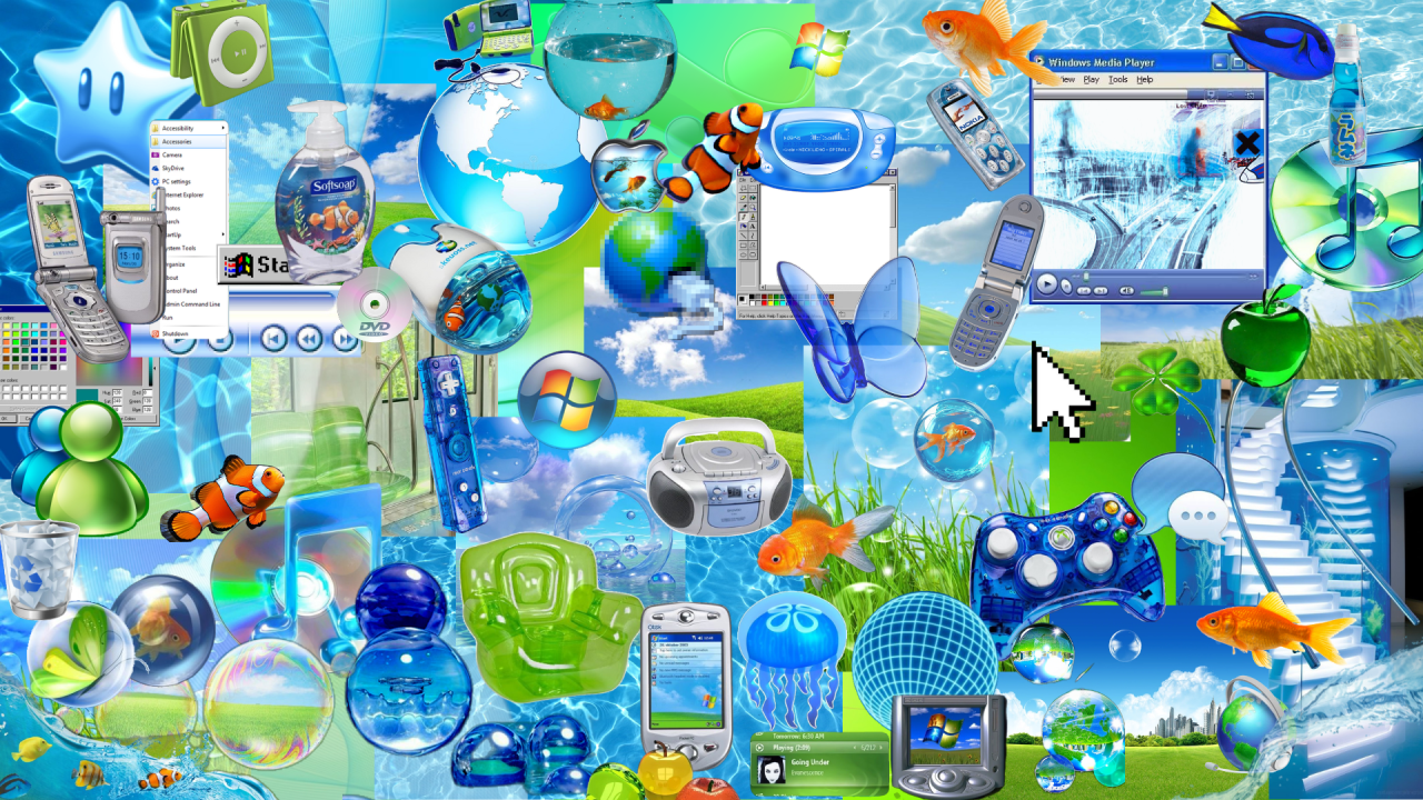
The Retro Frutiger Aero City Aesthetic represents a fascinating intersection of design, technology, and culture. Emerging from the optimistic design language of the mid-2000s, the aesthetic has been revived in the 2020s as a source of nostalgia and hope. The aesthetic’s characteristic elements glossy textures, nature-integrated design, bright colors, and organic forms create a vision of the future that is both futuristic and comforting.
As we navigate the complexities of modern digital life, the Retro Frutiger Aero City Aesthetic offers a space for imagining alternative possibilities. It reminds us of a time when technology felt more hopeful and more humane, and it encourages us to envision futures where technology and nature coexist in harmony. Whether viewed as a nostalgic retreat or as a source of creative inspiration, this aesthetic continues to captivate audiences and shape the way we think about the relationship between humanity, technology, and the urban environment.
The revival of Frutiger Aero ultimately reflects a profound longing for a more optimistic future a future that may not have materialized but that still has the power to inspire and to challenge us to imagine better possibilities. In a world increasingly dominated by algorithms and corporate design, the Retro Frutiger Aero City Aesthetic offers a vision of technology that is accessible, welcoming, and full of hope. As we continue to grapple with the challenges of the 21st century, this vision reminds us that the future is not predetermined but is something we can actively shape through creativity, imagination, and a commitment to building a better world.