
In the ever-evolving landscape of digital design and branding, it takes something truly extraordinary to capture the collective attention of the internet. In May 2026, that extraordinary phenomenon arrived in the form of a shimmering, reflective sphere: the disco ball. What started as a temporary rebranding by a music streaming giant quickly spiraled into a global internet sensation, birthing a new design trend known as “discomorphism.” This viral movement saw major tech companies, crypto platforms, and even AI giants transform their minimalist, flat logos into glittering, 3D mirror-ball versions, sparking a massive conversation about nostalgia, branding, and the chaotic nature of internet culture .
The Spark: Spotify’s 20th Anniversary Glow-Up
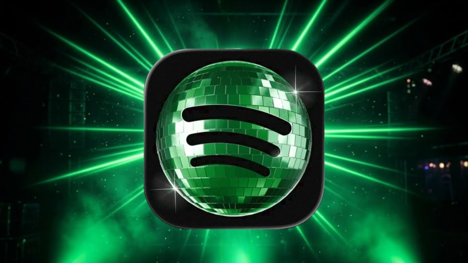
The genesis of the viral disco ball logo trend can be traced directly back to May 14, 2026, when Spotify, the world’s leading audio streaming service, made a bold and unexpected move. To celebrate its 20th anniversary, the company temporarily replaced its iconic, flat-green app icon with a sparkly, 3D green disco ball . This redesign was part of a larger campaign called “Spotify 20: Your Party of the Year(s),” a nostalgic in-app experience that allowed users to revisit their complete listening history, including their first streamed song and all-time favorite artists .
The intention behind the disco ball icon was to symbolize celebration, nightlife, music culture, and collective memory. Spotify wanted the anniversary to feel less like a corporate milestone and more like a global music party built around its listeners . The disco ball, with its ability to reflect light in multiple directions, served as a perfect visual metaphor for millions of individual listening journeys happening simultaneously around the world . Every playlist, breakup anthem, and workout track contributed to one larger, shared music culture.
The Backlash: A Pixelated Party or a Glittery Glitch?
However, Spotify’s festive gesture was met with immediate and intense backlash from its user base. The internet, as it often does, reacted with a mix of confusion and criticism. The core of the problem lay in the icon’s design and its functionality on a small smartphone screen. The 3D texture and dark green reflective tiles, which looked playful and vibrant at a larger scale, appeared blurry, pixelated, and muddy on the home screen of a phone . Users flooded social media platforms like X (formerly Twitter) with complaints.
The criticisms were varied and creative:
A. The “Loading” Issue: Many users reported that the new icon looked like the app was stuck mid-update or perpetually loading, which was an unsettling experience for a widely used application .
B. Visual Readability: The green color was considered too dark against the black background of many home screens, and the reflective texture made the logo difficult to recognize at a glance. Some users mistook it for a shield or a generic, unidentifiable symbol .
C. Aesthetic Displeasure: The design was widely panned as “cheap,” “sterile,” “grim,” “pixelated garbage,” and even “the biggest downgrade in history” .
D. Loss of Brand Identity: For a brand as recognizable as Spotify, the sudden change felt jarring and unnecessary. One user on X stated that the logo had “major legibility and visual identity issues” .
From Chaos to Culture: The Birth of Discomorphism
Despite the overwhelmingly negative initial reaction, or perhaps because of it, the story took a sharp and unexpected turn. On May 17, just days after the launch, Spotify responded to the backlash with a characteristically lighthearted and apologetic tone, posting on X: “Alright, we know glitter is not for everyone. Our temp glow up ends soon. Your regularly scheduled Spotify icon returns next week” . This confirmation that the change was temporary should have ended the saga. Instead, it marked the beginning of one of the most fascinating branding trends of the decade.
The turning point came when OpenAI’s ChatGPT account joined the conversation. The verified ChatGPT Instagram account posted a mirror-ball version of its own iconic logo, transforming its familiar geometric swirl into a reflective, glittering sphere . The caption simply asked, “What do you guys think?” and OpenAI’s official account replied, “Everyone is going to love this” . The post quickly amassed over 180,000 likes.
This moment was pivotal for several reasons:
-
Reframing the Narrative: ChatGPT’s participation reframed the disco-ball aesthetic from an unwanted and ridiculed redesign into a shared joke and a participatory trend that brands and users could engage with together .
-
Ironic Timing: The move was particularly notable because, in late 2025, ChatGPT had already drawn comparisons to Spotify after launching “Your Year with ChatGPT,” a personalized year-end recap inspired by Spotify Wrapped .
-
Catalyzing a Movement: Once one of the most prominent AI companies embraced the aesthetic, it gave other brands the permission and social license to join in without fear of being ridiculed .
Soon after, a flood of other companies jumped on the bandwagon. Notion, MoonPay, Uniswap, Picsart, and Appwrite all posted their own disco-inspired logo redesigns . The trend was no longer about one app icon; it had evolved into a collaborative internet meme, a moment of playful chaos where brands could show their human side and participate in the viral conversation.
The Name and the App: Solidifying a Trend
As the trend gained momentum, a new term emerged to describe this glittery design philosophy: “Discomorphism.” The word cleverly combines “disco” with “skeuomorphism,” the old design philosophy where digital interfaces were designed to resemble their physical real-world counterparts. Early smartphones, for example, featured notepads that looked like paper, bookshelves that appeared wooden, and buttons that were tactile and 3D .
Discomorphism takes this concept to an exaggerated, maximalist extreme. Logos are coated in reflective mirror tiles, lit dramatically with cinematic lighting, and transformed into shiny, 3D objects reminiscent of classic disco balls . This was a direct departure from the flat, minimalist design language that had dominated app and logo design for over a decade .
To further democratize and accelerate the trend, a tool simply called “Discomorphism” was developed using an AI platform called Lovable . The web-based app allows anyone to upload a logo and instantly “discofy” it, generating a reflective, mirror-ball version in seconds . The app’s tagline, “Make your logo dance,” perfectly captured the playful and accessible nature of the trend. Users soon flooded social media with their creations, turning everyday app logos into sparkly, party-ready versions and sharing screenshots of their “discomorphic” home screens .
Why Did This Trend Explode in 2026?
The rapid and widespread adoption of discomorphism was not a random occurrence but a confluence of several significant cultural and technological factors.
A. The Rebellion Against Flat Design
For over ten years, digital design was dominated by flat minimalism: clean lines, simple colors, and stripped-down interfaces. By 2026, many designers and users had grown tired of this aesthetic. The collective desire for more texture, dimensionality, and expression was palpable. Companies like Apple were also responding to this shift with their new “Liquid Glass” interface language, which introduced translucency, depth, and reflections . Discomorphism became the internet’s loud, meme-driven version of this yearning for more expressive digital spaces .
B. The Power of AI and Meme Culture
The trend’s explosion was fueled by the accessibility of AI tools. The “Discomorphism” app made it possible for anyone to participate, turning a niche design trend into a universal social media activity. Furthermore, the brands that succeeded in this movement were the ones that reacted fastest to the meme culture. Instead of sticking to traditional, slow-moving corporate branding rules, they embraced the chaos, showing their agility and internet savviness .
C. The Nostalgia Factor
The 2020s have seen a massive resurgence of nostalgia for the Y2K era and retro aesthetics. The disco ball itself is a powerful symbol of a bygone era of nightlife, glamour, and carefree celebration. Spotify tapped into this directly with its “Spotify 20” campaign, which was focused on personal nostalgia and music memories . The disco ball logo became a visual shorthand for this collective yearning for a more vibrant and playful past.
The Big Players and Brand Participation
The trend was largely driven by the official participation of major brands, who used it as a form of community engagement.
-
ChatGPT (OpenAI): Played the crucial role of legitimizing the trend after the initial backlash, transforming it into a shared cultural moment .
-
Google: Joined the trend with a playful twist by introducing a disco-ball-inspired app icon pack for its Pixel phones. This allowed users to transform their entire home screen into a “disco party,” showing that even the largest tech companies were willing to have fun with the aesthetic .
-
Various Tech and Crypto Brands: Companies like Uniswap, MoonPay, and Notion participated by “discofying” their own logos, often with humorous comments in the replies .
-
Other Brands: The trend extended beyond tech, with brands like American Eagle, Dutch Lady Malaysia, Grammarly, Hello Fresh, and Subway Malaysia also creating their own disco-ball versions of their logos .
Google’s Pixel and the Mainstreaming of Discomorphism
A significant milestone in the trend was Google’s decision to incorporate a disco-ball design into its Android customization tools. The company rolled out a new AI-generated icon pack for Pixel phones, turning familiar app icons into glittery silver versions . This move was significant because it transitioned the trend from a temporary marketing gimmick to a permanent, user-controlled design option. Users could now apply the “discomorphism” aesthetic to their entire device, making the home screen a customizable expression of their personality . This move by Google shows how deeply the aesthetic had permeated the design consciousness and was no longer just a fleeting joke but a legitimate stylistic choice .
The Long-Term Implications: Branding in the Age of Memes
The viral disco ball logo trend offers profound insights into the future of branding and internet culture. It signals a fundamental shift in how brands interact with their audiences.
A. Community-Driven Branding
The trend highlights how branding is becoming more community-driven and meme-focused. Instead of polished, long-term campaigns, companies are increasingly using temporary visual trends to boost engagement and stay relevant online. The success was less about the quality of the design and more about the ability to participate in a shared, fast-moving online moment .
B. Agility Over Perfection
The ability of brands to react quickly to memes and viral moments is now more valuable than traditional corporate branding rules. The brands that “won” in this scenario were those that responded to the joke with humor and speed, rather than ignoring it or defending their original design choices . The evolution from backlash to participation is a case study in how to turn criticism into free marketing.
C. Temporary Design as a Strategy
The trend demonstrates the power of temporary, commemorative design. Users are increasingly drawn to brands that are willing to experiment and show a playful side, even if it’s just for a short period. Just as apps adopt themed icons for holidays or special campaigns, Spotify’s disco ball was a successful “brand costume” for a digital party . This approach allows companies to engage with current trends without compromising their long-term brand identity.
D. The Return of Maximalism
Finally, the trend is a strong indicator of a broader cultural shift from minimalism to maximalism. The clean, simple, and often sterile aesthetics of the past decade are being replaced by a desire for expressive, textured, nostalgic, and visually loud design. Discomorphism is a perfect example of this new wave, a testament to the internet’s ability to create, name, and popularize its own creative movements .
Conclusion
The viral disco ball logo trend of 2026, encapsulated by the term “discomorphism,” was far more than just a strange internet joke. It was a multifaceted cultural phenomenon that revealed the changing dynamics of digital branding, the power of AI in democratizing design, and a collective yearning for a more expressive and playful visual world. What began as a heavily criticized redesign by Spotify was transformed into a global movement by the chaos of the internet, the participation of AI giants like ChatGPT, and a shared moment of digital nostalgia. It showcased how a design that is initially met with “hate” can become a symbol of viral marketing success.
The trend was a rebellion against the perceived sterility of flat design and a celebration of retro aesthetics. It proved that in the age of memes, the brands that win are those that can adapt quickly, engage with humor, and treat their logos not as untouchable symbols, but as digital avatars that can be dressed up for a party. While Spotify’s glittering icon may have vanished from the home screen, the legacy of “discomorphism” will likely influence branding strategies for years to come, reminding marketers and designers that sometimes, a little bit of chaos is exactly what the public wants. The era of the disco ball was a short but unforgettable dance, and its impact will be felt long after the last mirror tile has faded.